


The title of choreographer Yvonne Rainer’s 2006 memoir, Feelings Are Facts, describes the knot of perception, language, and emotion that make up an autobiography. But it’s an interesting choice for her. Rainer’s dances tended to avoid emotionally expressive movements. She’s sometimes called a minimalist, and she did her best-known work in the same 1960s downtown scene that gave rise to conceptual art, performance art, and minimal art. (Her artistic collaborator and romantic partner at the time was the minimalist sculptor Robert Morris.) Ask a thousand art historians to describe minimalism and you’ll probably never hear the word “emotion”. But it’s an art movement that captured a major shift in our understanding of subjective experience and the human body.
Since that era, many of us have begun to think differently about bodies and their capacity for feeling and action. But we still struggle to talk about this capacity, let alone measure it. Anything that can be felt but not measured often gets overlooked, but that doesn’t mean it’s not important. On the contrary, this invisible capacity is one of the most powerful forces in society, shaping the path of our lives while largely evading our awareness.
I started jotting down notes for this essay ten years ago. Unsurprisingly, once I started composing it for Substack I realized it could not be contained in a single post. So here’s the first half, which focuses mostly on art. It’ll be followed by the second half, which will venture farther afield into subjects like liberation movements and conservative politics.
EMBODIED PERCEPTION
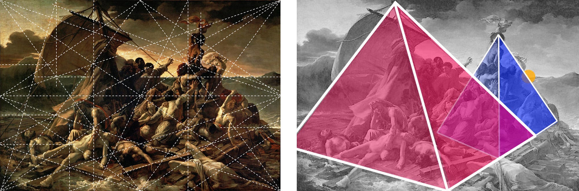
Formalism, a form of visual analysis first developed by art historians in the early twentieth century, worked by breaking down a work of art into basic elements, like color and composition. Artists, of course, were already one step ahead of them. In 1890, the French symbolist painter Maurice Denis wrote, “Remember that a picture, before it is a picture of a battle horse, a nude woman, or some story, is essentially a flat surface covered in colors arranged in a certain order.” As it was conceived, formal analysis could be applied not just to modern art but to any art, from cave paintings to Pop art to ceremonial masks. Using this supposedly objective tool, an art historian could underwrite the universal artistic value of every artwork in a museum’s collection, free from the limitations of its historical time and place.
By setting aside a painting’s cultural dimension in favor of empirical analysis, the formalists democratized art — or at least that was their claim. In practice, formal analysis was mostly used as a tool to legitimize art’s status quo. This tool, in the hands of critics, curators, and art historians, was a way to defuse modern art’s revolutionary impulses, replacing the artist’s original intent with an elegant glorification of the art establishment. Formalism, it turned out, was an exercise in taste, not science.
Abstract art and formalism were made for each other. They emerged at the same historical moment, and they just kept proving each other right. As with many perfect love stories, though, their relationship eventually lost its spark. Without the revolutionary sizzle, everything started to feel a little… tasteful. Tired of being trapped in a ten-thousand-year relationship with the art of the past, artists became a lot more promiscuous. They tried out new positions. They embarked on inner journeys. (Yes, this was the 1960s.)
Maurice Merleau-Ponty’s book Phenomenology of Perception, which first appeared in English in 1962, presented a new way to think about the relationship between an artwork and its beholder. According to Merleau-Ponty, when someone encounters a painting, they do so not just with their eyes but with their entire being — all the various inputs and reactions that make up their perceptual consciousness. Just like you’re aware of the position of your body and its location in space, the process of encountering an artwork is both mental and physical. When you look at an abstract painting and see depth, it’s not (just) because you’re familiar with the rules of perspective, it’s because you’ve spent your whole life moving through three-dimensional space.
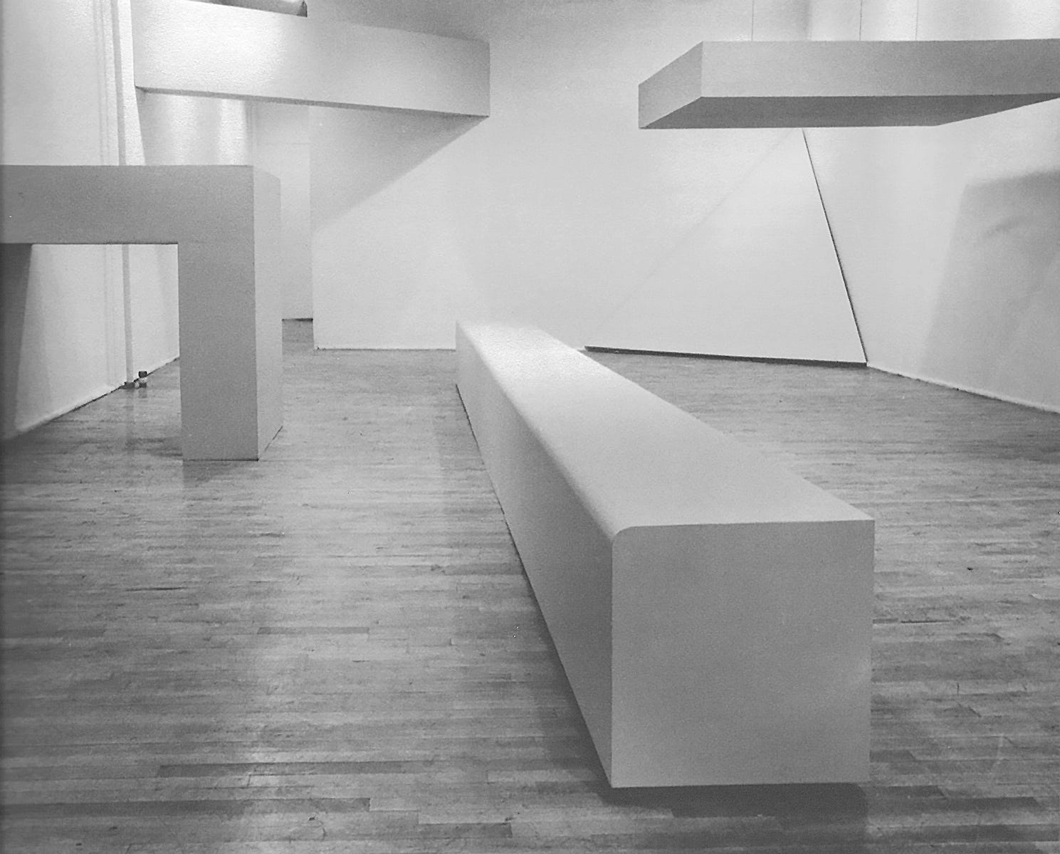
This idea that our retinas aren’t our only tool for perceiving the world, it turned out, resonated with a lot of artists in the 1960s. And they responded to it with an explosion of different artistic modes, like conceptual art and performance art. Minimalist artists started making abstract paintings that looked like objects, and sculptures that worked like abstract paintings: occasions for experiencing the interaction of light, color, and perspective. In contrast to Maurice Denis and his “colors arranged in a certain order”, a minimalist artwork’s composition was not to be found in brushstrokes on its surface. Instead, the composition existed in the perceptual consciousness of the person encountering it (their “being-in-the-world”, as Merleau-Ponty put it). In a 1966 essay, Robert Morris pointed out that sculpture’s “most patently unalterable property — shape — does not remain constant. For it is the viewer who changes the shape constantly by his change in position relative to the work.” In short, the whole premise of formal analysis was flawed, because there is never just one objective way to perceive an artwork. Art is primarily visual, but we are not floating eyeballs. Perception takes place inside a unique body with a unique consciousness. What two people take away from an artwork is as different as what they bring to it.
DECOR
The American critic and art historian Clement Greenberg was a big-time formalist, even though he disliked the term. For him, truly advanced modern art was the pure expression of its particular medium. And the “unique and proper competence” of painting was a flat arrangement of paint on a surface. He agreed with Denis on this point, but he took it a step further. Advanced painting, Greenberg insisted, had no room for things like battle horses, nude women, or (heaven forbid) stories. In fact, the merest trace of a non-optical effect, like narrative, politics, or texture, could completely undermine a painting’s integrity.
Among all these “impure” effects, the one that most troubled modern abstract painting was decoration. Why did it attract so much scorn from serious modern artists? What made decoration, as Greenberg put it, “the specter that haunts modernist painting”?
Decoration anxiety, it turns out, was even older than modernism. Artists from Michelangelo to Jacques-Louis David had eliminated excessive ornamentation to ensure their work was meaningful, not merely sensuous. If you look at the pejoratives hurled at decoration over the years — irrational, seductive, superficial, deceptive, impractical, frivolous — you will detect more than a whiff of misogyny. In Greenberg’s New York, the femme-coding of decoration was so complete that, even when bold women like Helen Frankenthaler made action paintings on the same heroic scale as their male counterparts, their work was still dismissed as “decorative”, “lyrical”, and of course “feminine”— words almost never used to describe men’s paintings.
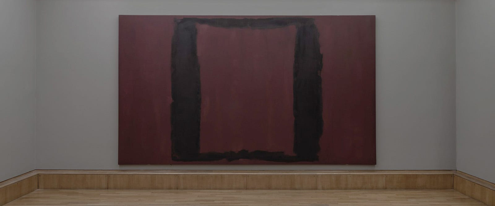
In 1958 the artist Mark Rothko accepted a commission for a group of paintings to hang in the Four Seasons restaurant at the brand new Seagram Building, Mies van der Rohe’s high-modernist masterpiece in midtown Manhattan. The commission was as prestigious as they come. Still, Rothko was rattled by the thought of his paintings serving as decor. “I hope to ruin the appetite of every son of a bitch who ever eats in that room,” he declared. After two anguished years in the studio, he backed out of the commission and returned the fee. (When he finally finished the paintings, which resembled large pools of blood coagulating in rectangular shapes, he gave them to the Tate Gallery in London.)
These men’s hysterics seem almost comical now, revealing just as much about the gender norms of midcentury America as they do about art history. For Rothko, having his paintings seen as decor not only jeopardized his artistic vision, it threatened his whole identity as a great artist. During those years, the pinnacle of artistic greatness was a narrow ledge populated almost exclusively by straight white men. (The greatest among them were literally called masters.) In their view, if their work was going to be used as decor, they might as well start arranging flowers or designing cocktail dresses. (For context, New York’s most famous interior decorator of the time, Billy Baldwin, identified as “one-thousand-percent homosexual.”)
So what is decor, this thing that so terrified Rothko and his set? It can serve a practical function, like providing something to sit on, but decor’s main job is to create an atmosphere. To succeed, it must be attuned to the tastes of the people using the space. At the same time, it should attune them to the behaviors and emotions that are appropriate there, whether the space is a dance club, a funeral parlor, or a kindergarten. In this way, decor has a social purpose, playing a supportive, even caring role in our lives. It’s not there to ruin our appetite (at least not intentionally).
A modern museum has its own interior-design conventions. Its walls are famously neutral, but it finds many ways to foster an atmosphere of reverence, contemplation, and awe. It primes us for a limited range of actions and a specific register of feelings. For the most part, we’re not even aware this is happening. And that’s how decor does its job. We notice the museum’s white walls, its polished floors, its soaring atrium, but not really how they affect us as we move through the space. Not everyone will get the message (just ask a parent who has taken a toddler to a museum), but it cultivates the kind of people who do.
This returns us to the minimalists. Like other “serious” artists of their time, they avoided anything decorative. But they shared the same goal as any ambitious interior decorator: they wanted to create situations. They wanted the viewer to encounter their art not just with their eyes but with a deeper perception, one rooted in their bodily experience of moving through space. The minimalist sculptor Tony Smith touched on this when he described driving on the newly constructed (but still unopened) New Jersey Turnpike in the early 1950s:
It was a dark night and there were no lights or shoulder markers, lines, railings, or anything at all except the dark pavement moving through the landscape of the flats, rimmed by hills in the distance, but punctuated by stacks, towers, fumes, and colored lights. […] This drive was a revealing experience. It seemed that there had been a reality there that had not had any expression in art. The experience on the road was something mapped out but not socially recognized. I thought to myself, it ought to be clear that’s the end of art. Most painting looks pretty pictorial after that. There is no way you can frame it, you just have to experience it.
What Smith is getting at — the almost indescribable sensation of hurtling through a vast, unfamiliar landscape on a dark and empty highway — doesn’t fit easily into an aesthetic category. It contains some elements of the sublime but not the spiritual dimension. It’s not pictorial, so it can’t be judged on formal terms. And Smith can’t capture it with language either, instead telling us, with a shake of his head, that we just had to be there.
AFFECT
Affect is a form of cognition that involves the entire nervous system. It’s related to emotion, but it has a distinctly physiological component. (Excitement, for example, is an affect, but it is associated with emotions as different as happiness and fear). Our nervous system doesn’t just process our sensory inputs. It also prepares us to act on those inputs. When we feel excitement, we’re ready to move, whether that means running to someone’s embrace or running away (not knowing the difference was a big part of my middle-school experience). Because of this potential, affects can have a powerful charge.
At the same time, affects hover on the fringes of our awareness. They’re not the subject of everyday conversation, the way emotions are. An affect is your gut reaction (or the shift in your heart rate, skin conductivity, and pupil dilation), while emotion and mood are the meaning you give to that affective reaction. Emotion and mood are how we make sense of our affects, to ourselves and to others.
The notion of affect spans different fields. In 1962 the psychologist Silvan Tomkins identified nine primary affects (joy, excitement, surprise, rage, disgust, dissmell, fear, shame, distress), which he called the “biological portion of emotion”. Today many psychologists simply use affect as a synonym for emotion, feeling, or mood. Doctors and social workers use it to categorize a patient’s emotional presentation (positive affect, blunted affect, etc.). It’s also commonly used to describe a person’s mannerisms and speech (a stilted affect, a gay affect). In academia, the field of affect studies emerged in the 1990s, and since then it has inspired novel approaches to critical theory (by way of Gilles Deleuze and, further back, Spinoza), enabling some of the most important recent developments in feminism, Marxism, and queer theory.
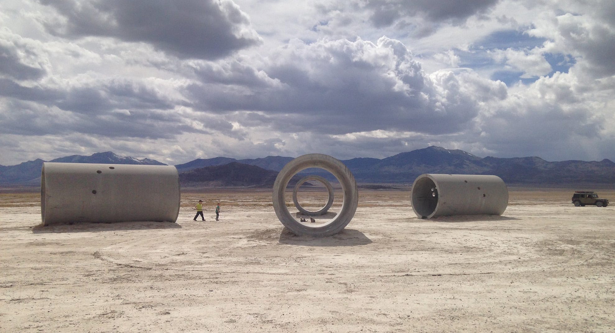
It’s interesting to wonder how Tony Smith might have framed his turnpike epiphany if he’d had access to these ideas. What he did instead was make sculptures that explored the same principles as his fellow minimalists: geometry, perspective, scale. In the late 1960s, land art grew out of and shared many of those ambitions and interests, including Smith’s preoccupation with emptiness and monumentality. But the land artists introduced another element: site specificity. They went to great lengths to choose the location for their work. (Robert Smithson died in a plane crash while scouting a site.) And they weren’t searching for picturesque views in any traditional sense, favoring instead the arid expanses of Nevada, Utah, and New Mexico. For this reason, we mostly encounter the earthworks of land art only in photographic reproductions. Which is a shame, because without actually walking through a piece of land art, after a six-hour drive across vast salt flats, we’ll never really get this crucial dimension of it: the physiological experience of encountering the work in its setting. How important is atmosphere to these works? Well, imagine Nancy Holt’s Sun Tunnels (1973–76) in a supermarket parking lot instead of the Utah desert.
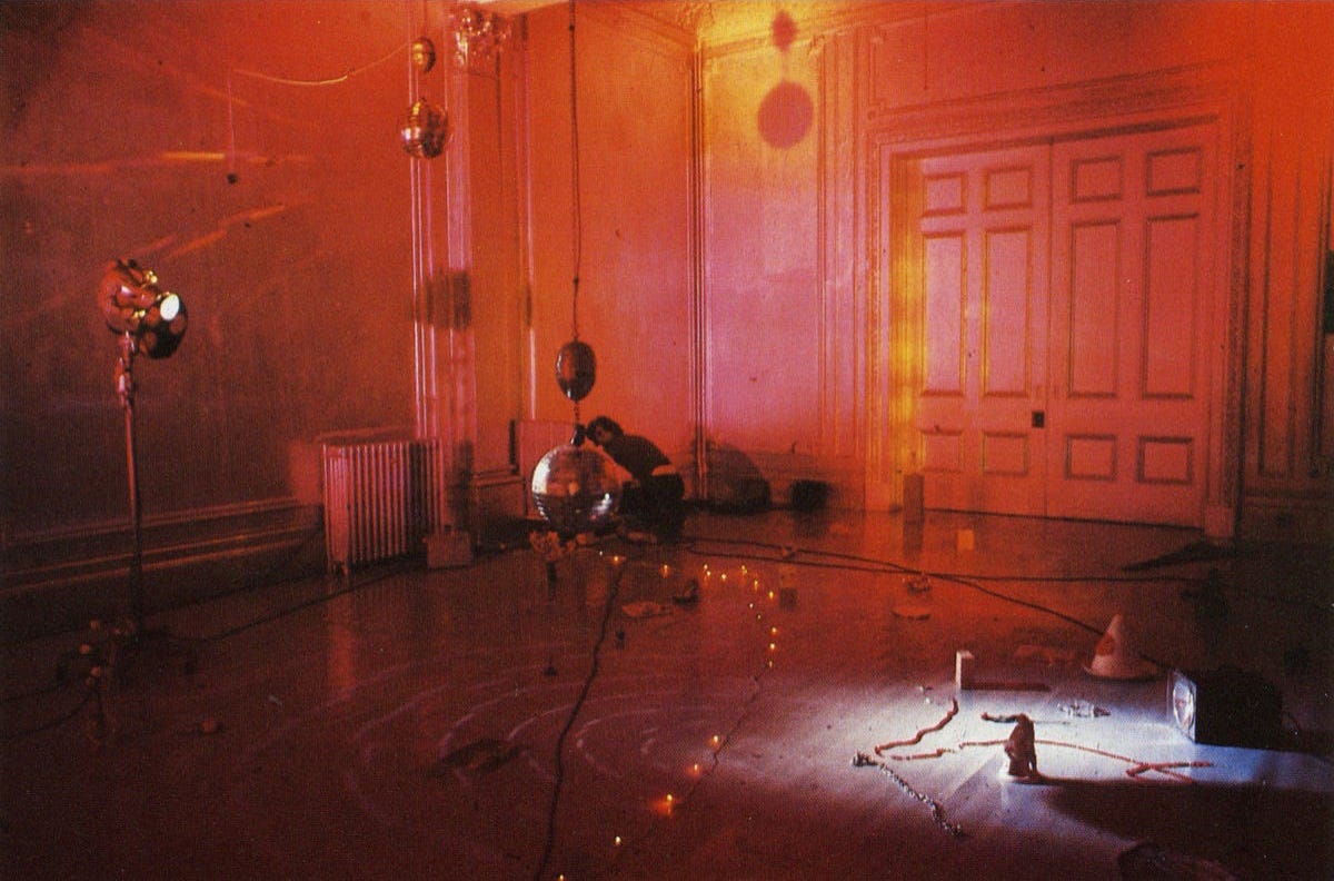
With installation art, which also emerged around this time, artists began to explore a much wider affective range. In some cases, they did so by openly embracing decoration. The work of the French-British artist Marc Camille Chaimowicz (beautifully summarized here) is a good example. For his early performance/installation Celebration? Realife (1972), he lived in a gallery and played records while continuously rearranging colored lights, disco balls, and trinkets around the space, subtly adjusting the atmosphere while making conversation with visitors. His subsequent works employed domestic decor — curtains, rugs, wallpaper, folding screens, all covered in muted patterns designed by the artist — in a lifelong quest to cultivate undefined moods and sympathetic emotions. He was, in his quiet way, committed to prying art out of the hands of the macho modernists.
In 1970s America, the painters Valerie Jaudon and Joyce Kozloff wanted to liberate painting from the same sexist and racist prejudices that tainted modernist abstraction. As original members of the pattern & decoration movement, they embraced many of the things midcentury modernism opposed: textiles, domesticity, non-Western art. For the feminist journal Heresies, they assembled a handy compendium of bigoted and bellicose statements made by performatively virile modernists, under the amazing title “Art Hysterical Notions of Progress and Culture” (1978).
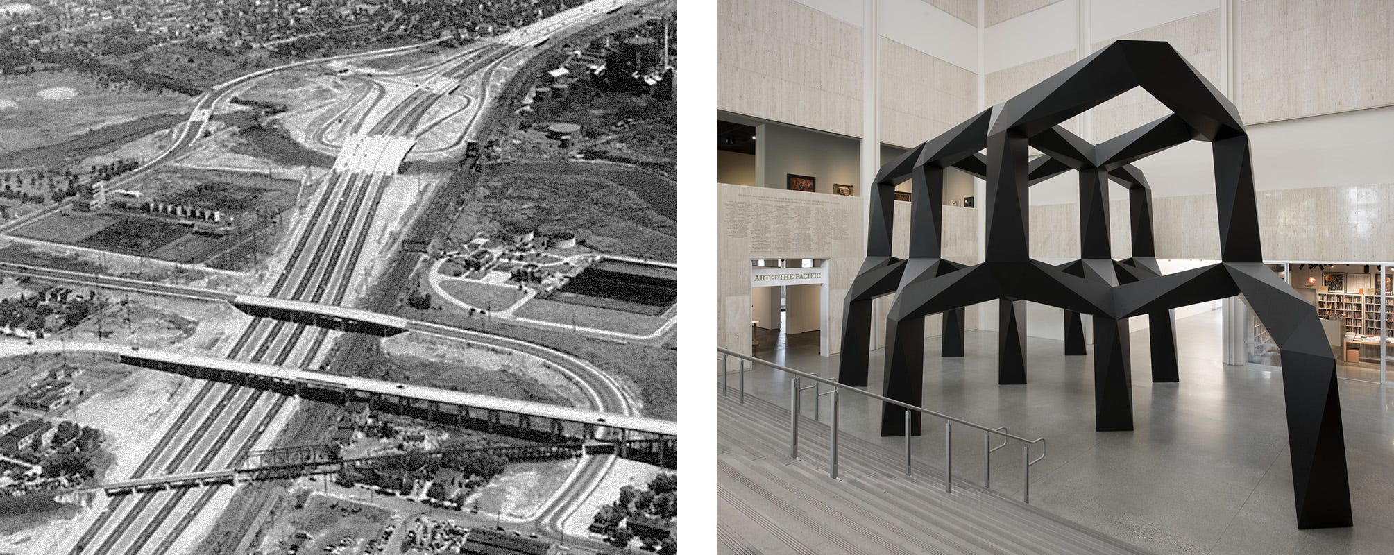
Since then, the old taboo against decor has continued to crumble. Painters today don’t just employ patterns and other decorative elements, they use decor itself to create an atmosphere for their work, rejecting the neutral white-cube setting. Some artists go a step further, creating paintings that defiantly embrace their role as decor. Matt Connors’s Continuous Color Circuit (Columns) (2018) is a composition made for the lobby of an Italian hotel. Each of its four panels is a vivid monochrome, with contrasting colors on the top, bottom, and sides, and the panels are hung on a four-sided column, each facing a different direction. The work’s composition relies on your movement through space, unfolding differently according to how you transit the four sides of the column. Or how you don’t. Connors says most people don’t even notice the work, which is okay with him. Like interior design, a painting can affect you even if you don’t stop to give it your attention. “I have no decor anxiety,” he admits.
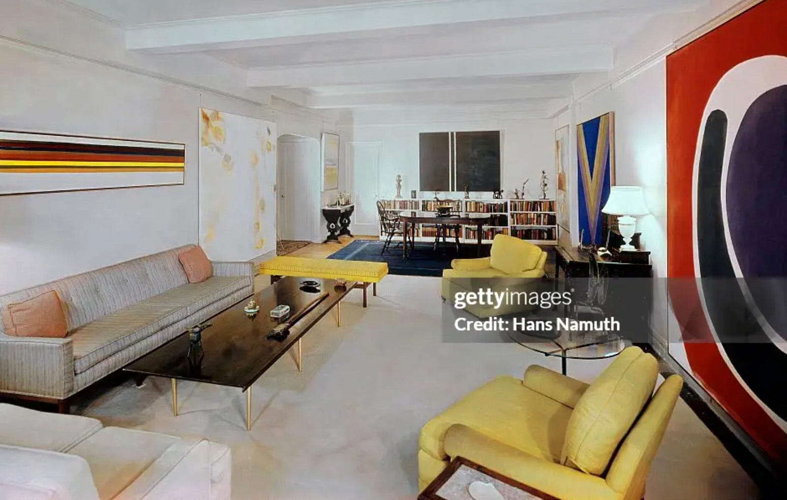
The funny thing is, the same was also true of macho modernist painting. Whether an artist admits it or not, their painting is an object in a space. Sometimes it’s the focus of our attention, but most of the time it isn’t. And it can affect us either way. When Rothko donated his Four Seasons paintings to the Tate Gallery in 1970, he included specific instructions for the color of the walls (“considerably off-white with umber and warmed by a little red”), the height of the paintings (“as close to the floor as possible, ideally not more than six inches above it”), and the lighting (“the light, whether natural or artificial, should not be too strong: the pictures have their own inner light”). The museum followed his instructions, and the resulting “Rothko room” absolutely had a mood, one that visitors to the Tate Gallery cherished for decades. I still remember my first encounter with it, in 1997. Compared to the bustling streets of central London and the brightly lit gilt-framed paintings in the rest of the museum, the Rothko room felt as soothing as a womb, as somber as a tomb. I guess the Abstract Expressionists understood more about interior design than they let on. Even Clement Greenberg appreciated the power of decor. If you don’t believe me, take a look at his living room — now that’s a domestic atmosphere.
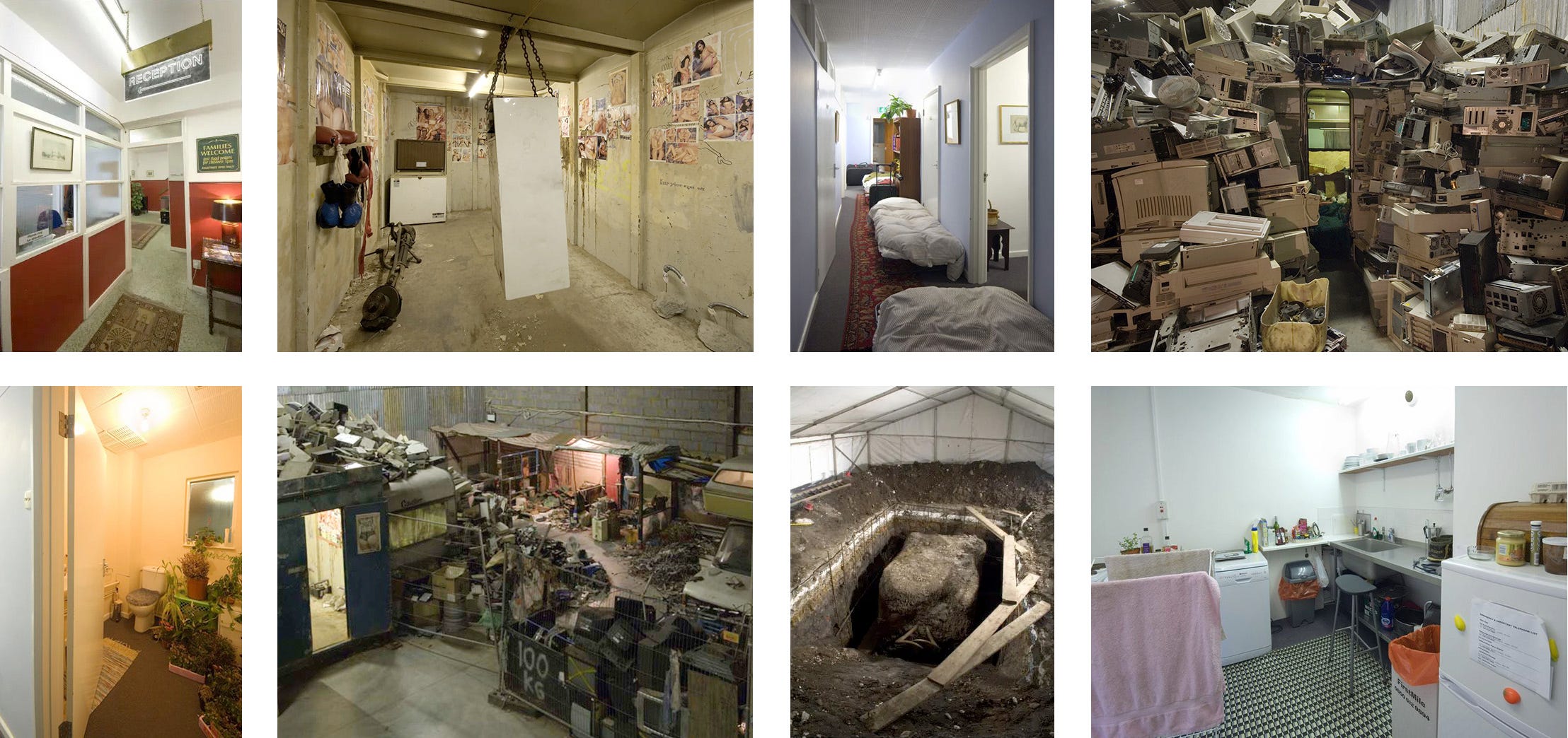
Since then, other artworks have affected me in new and undefinable ways. Many of them were immersive installation works from the 2000s. At one end of the spectrum was David Hammons’s Concerto in Black and Blue (2002), a pitch-dark and completely empty New York gallery, illuminated only by the tiny handheld blue light I picked up at the front desk. At the other end of the spectrum was Christoph Büchel’s Simply Botiful (2006), a warren of rooms and hallways built inside a dilapidated warehouse in east London, empty of inhabitants but filled with their stuff (beds, houseplants, dirty tissues, bathrooms, filing cabinets, half-eaten meals, porn magazines, TVs playing sports), as if these people had briefly stepped out and might return any moment. Eventually I emerged into a secondhand-refrigerator shop, where, by climbing down a ladder through an old freezer, I ended up in a vast archeological dig in the basement’s musty soil. Simply Botiful’s meaning had something to do with the abject dimension of global capitalism, but what everyone remembered was the feeling it gave off: an affective cocktail of distress, excitement, and disgust.
VIBE
Whenever you look up a restaurant online, Google Maps will offer you images of the place, grouped into categories: Street View, Food & Drink, Menu, and Vibe. The word vibe is a deliberate choice. It’s not decor or interior. Even atmosphere wouldn’t suffice. What the Vibe photos promise to show is not just what the restaurant looks like inside but also the kind of people you’ll encounter there. A big part of the charge I got from Büchel’s Simply Botiful had to do with walking through other people’s private space. If they had actually been present, though, the affective charge would have been completely different (and way more intense). Vibe takes atmosphere to another level. It’s no longer just about how the decor is attuned, it’s about potential social encounters. If the Vibe photos for a bar show thirty white guys in khaki pants shout-laughing at each other, you’ll understand what kind of experience you could have there. And you might search for a different bar instead, one with photos of people you’d actually enjoy rubbing elbows with (or rubbing other body parts with, if that’s your objective).
The highest compliment, the ultimate goal of every bar, nightclub, or restaurant, is an immaculate vibe. Everyone has different criteria for an immaculate vibe, of course, but the implication is that pretty much anyone will find something to like about the place, thanks to its well-tuned atmosphere and the potential for felicitous interactions.
As far as 2000s installation art goes, the most immaculate vibe belonged to Olafur Eliasson’s The Weather Project (2003). Commissioned by Tate Modern for the museum’s vast turbine hall, The Weather Project was like a piece of land art indoors. Dimly illuminated by sodium lights set in a semicircular scrim, which a mirrored ceiling reflected into a circular disk, the rest of the space was mostly empty aside from the slight haze of a fog machine. But the result was literally atmospheric, an indoor sunset that induced both surprise and joy in the two million people who flocked to see it: a lively mix of art fans, tourists, school groups, regular punters. You might have found yourself lying on the floor, holding hands with strangers as you arranged your bodies into words reflected in the mirrored ceiling. Or you might have simply enjoyed your sensory experience in wordless kinship with the people all around you, as you might do on the dancefloor of a dim, fog-filled nightclub.
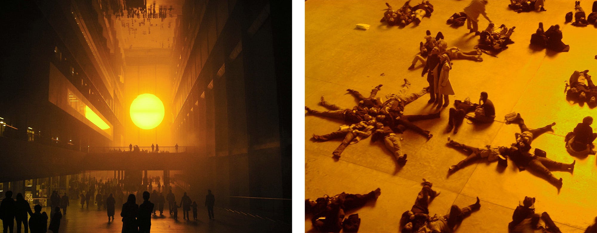
We should be careful not to reduce these installation works — or any artwork — to the subjective reactions of its viewers. Form is still an essential component, as is the artist’s intention. But if you surveyed the two million people who visited The Weather Project, many of them with no prior background in art, I bet you would discover that the breadth of their reactions surpassed even the artist’s own wildest speculations.
How can we even begin to capture the range of those reactions, short of actually surveying two million people? Even now, I have a hard time describing how I felt in that space. The work affected me in ways that evaded my awareness and still frustrate my language. So how do we deal with something we can’t analyze or even describe?
According to the painter Wasily Kandinsky, an artist’s job is to “endeavor to awaken more subtle, undefined emotions. […] His creative work will surely arouse in observers, who are capable of deeper response, emotions that cannot be defined in words.” Kandinsky was an early evangelist for non-objective (i.e., abstract) art, and that quote comes from his influential 1911 book On the Spiritual in Art. (Here’s a PDF of the first complete English edition, which was published by the Museum of Non-Objective Painting in 1946, six years before its rebranding as the Guggenheim Museum.) Kandinsky’s work had a profound impact on the history of abstraction, but his writing was largely ignored by art historians like Greenberg, since it contradicted formalist art criticism. Formalism, after all, was an appeal to materialism and empiricism, while Kandinsky’s theory of art was proudly metaphysical. Like many pioneers of abstraction, including Hilma af Klint and Piet Mondrian, his art was motivated by spiritualism, the quasi-religious movement best known for séances, Ouija boards, and astral projection. (The closest thing spiritualism had to leaders, spirit mediums, were predominantly women — perhaps another reason why formalist art historians scoffed at it.) Spiritualism exerted a lasting influence on American culture, giving rise to the New Age movement, among other things. But I would argue that spiritualism’s greatest contribution to contemporary civilization is the concept of vibes.
Kandinsky leaned heavily on the concept in his writing. (One of many examples from On the Spiritual in Art: “Expressions such as ‘sad’, ‘joyful’, are very superficial and serve only as guides to finer non-objective spiritual vibrations.”) The 1960s gave us the shortened version — vibes — and the wider definitions we use today: a shared human sentiment (AKA zeitgeist, sort of) or the ineffable sensation of an experience or a place (AKA affect).
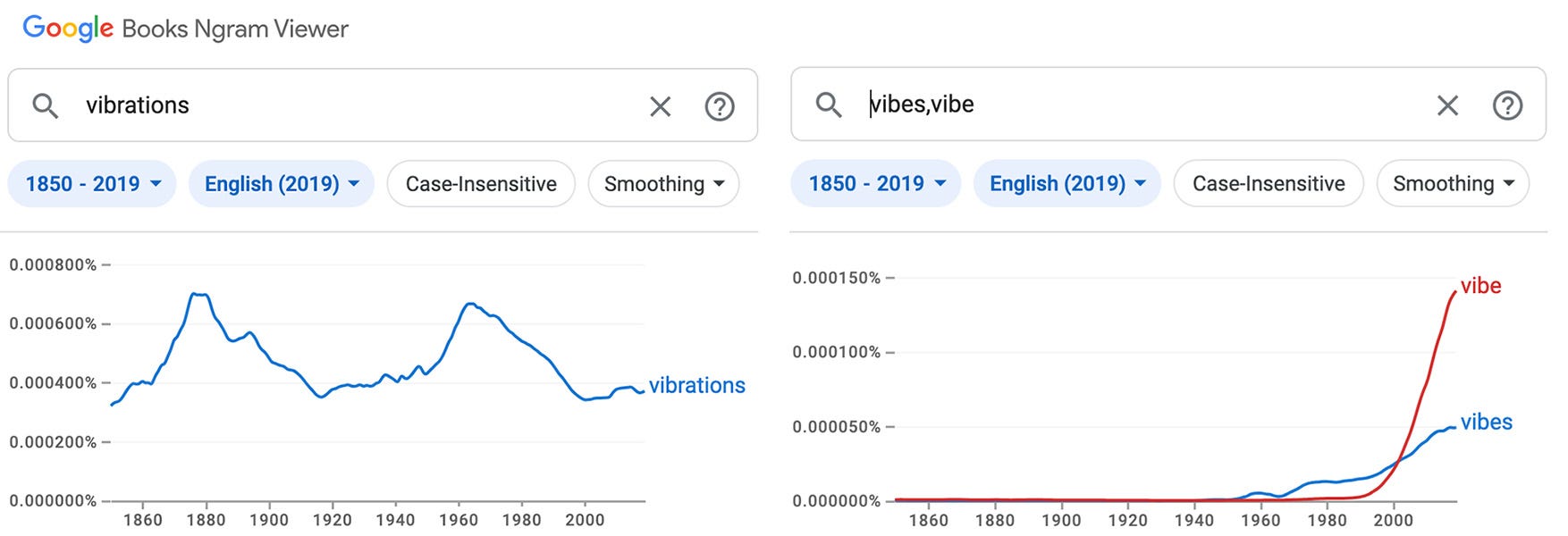
In books the appearance of the words vibe and vibes has risen sharply during in twenty-first century, and during the last few years their use in social media, podcasts, song lyrics, television, news media, and everyday conversation has increased dramatically. Clearly, the concept of vibes has become extremely useful to us, even when we use it irreverently (“The staff meeting this morning had a real WWE Smackdown vibe!”). We reach for it whenever something is difficult to articulate and/or impossible to prove. Feelings are facts that can’t be falsified.
In my next post I’ll consider the role of those feelings in the creation of social groups and how they’re used to exploit and empower people. We’ll also look at recent attempts to quantify vibes and why supposedly objective fields like political science and economics have come to embrace the incalculability of vibes.
Until then, keep on…